Case Study – Brand Identity & Web Design
A compass-led identity and a 27-page website for Mamma Mia Advisory Solutions, a professional services network working across the UK and the UAE – taken from signed-off designs to a tested build in three working days.
The challenge
Mamma Mia Advisory Solutions offers accountancy, audit, consulting, UAE company setup, relocation, Islamic finance, coaching and AI services through an international partner network.
The founder wanted a site that felt premium and calm, and that let a business owner in London, a family relocating to Dubai and a finance team exploring AI each find their service quickly.
The brief: creative, clean and simple, with nothing that felt like a generic consultancy template.
Choose a direction, not a department. A visitor should never have to know how the firm is organised to find what they need.– Design note, Sanjay Lad
The idea
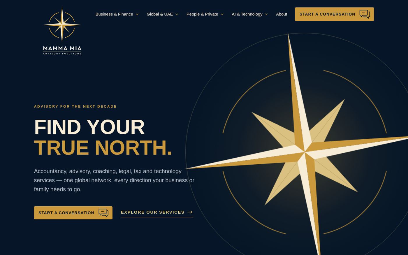
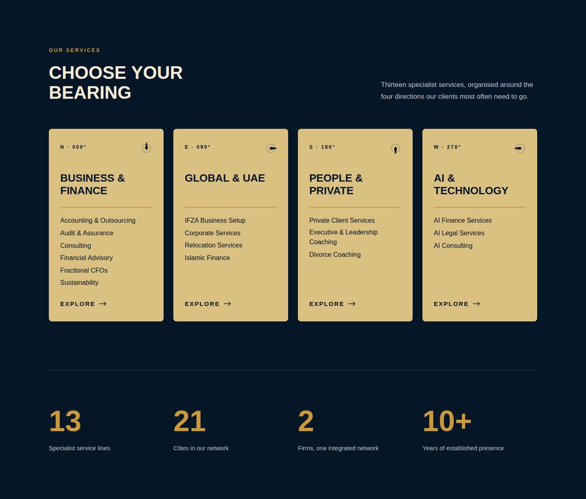
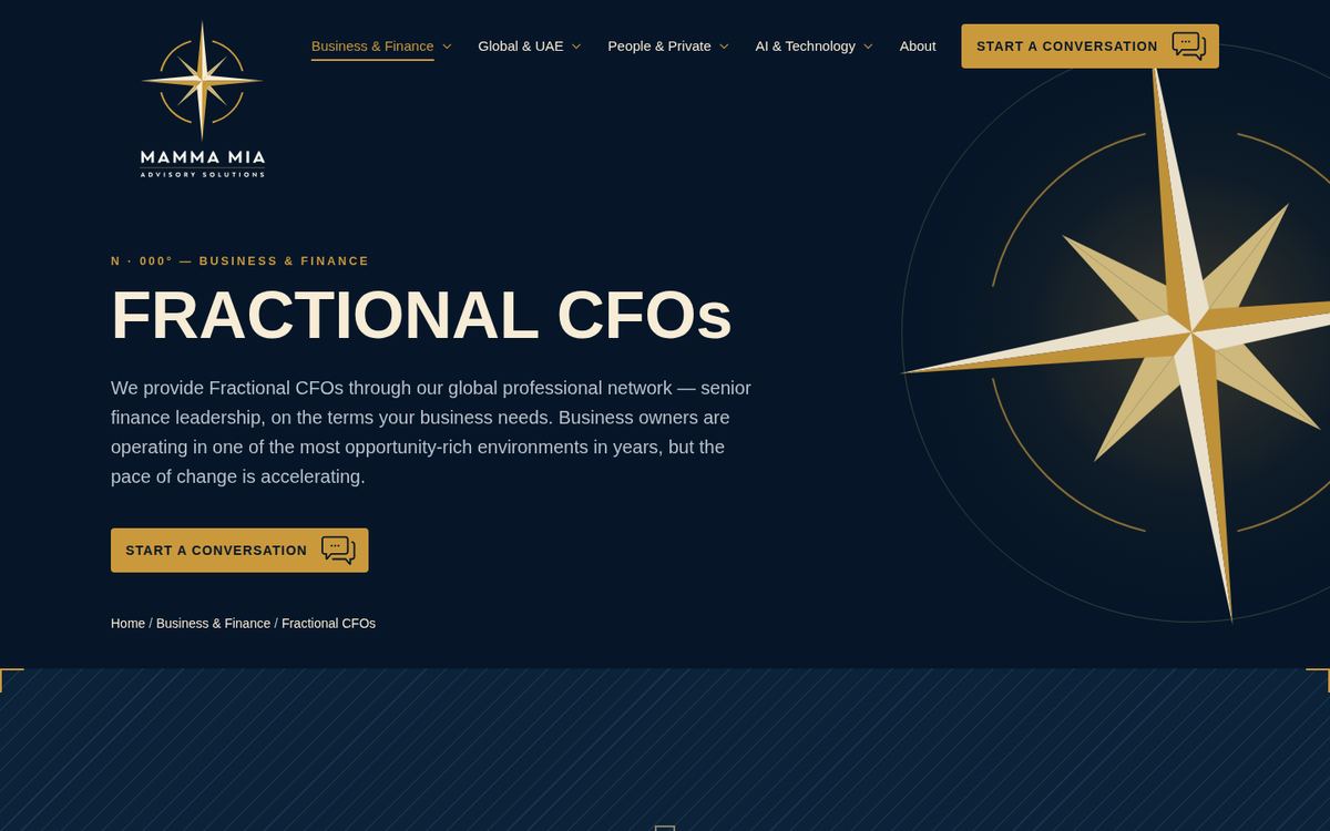
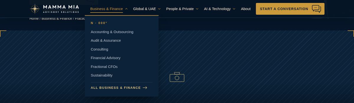
The logo's eight-point star became the organising idea for the whole site. Every service sits on one of four bearings, and the compass turns to point at whichever one the visitor is exploring.
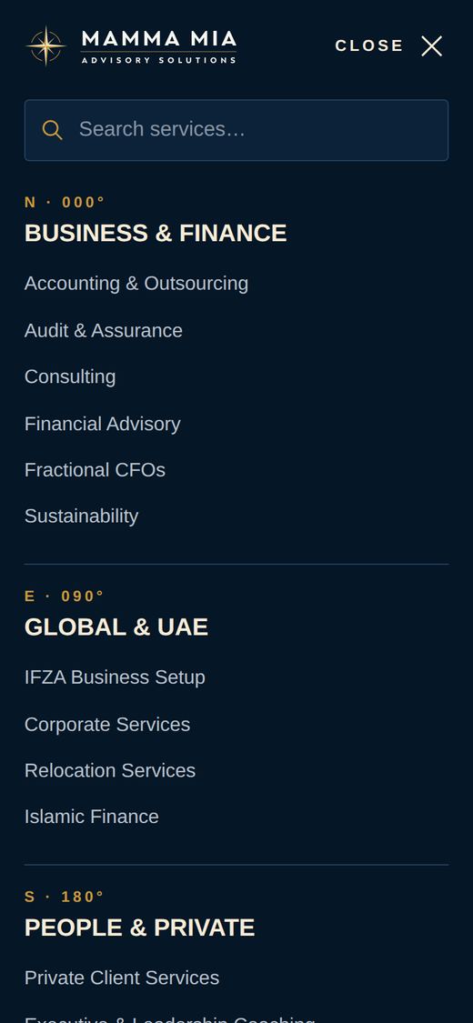
Accounting & Outsourcing · Audit & Assurance · Consulting · Financial Advisory · Fractional CFOs · Sustainability
IFZA Business Setup · Corporate Services · Relocation Services · Islamic Finance
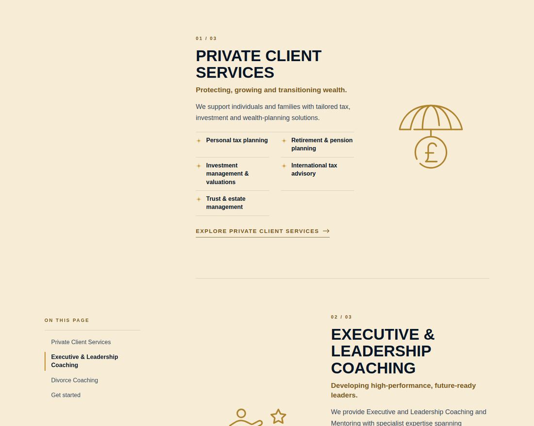
Private Client Services · Executive & Leadership Coaching · Divorce Coaching
AI Finance Services · AI Legal Services · AI Consulting
Identity
Colours taken from the logo's star, set against a night-sky navy. Headlines are bold uppercase Helvetica; small labels borrow a navigator's notation – N · 000°.
What I built
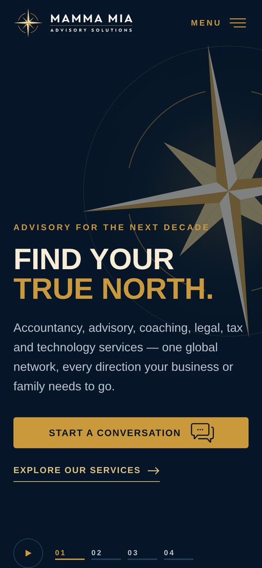
On the phone
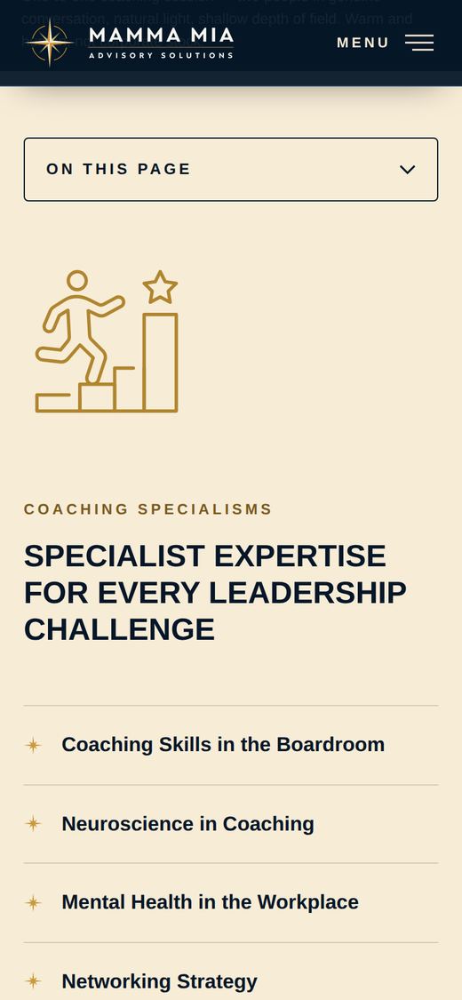
A full-screen menu grouped by bearing, with a search that filters the 16 services as you type. On service pages the "On this page" menu becomes a dropdown that jumps between sections.
Line art
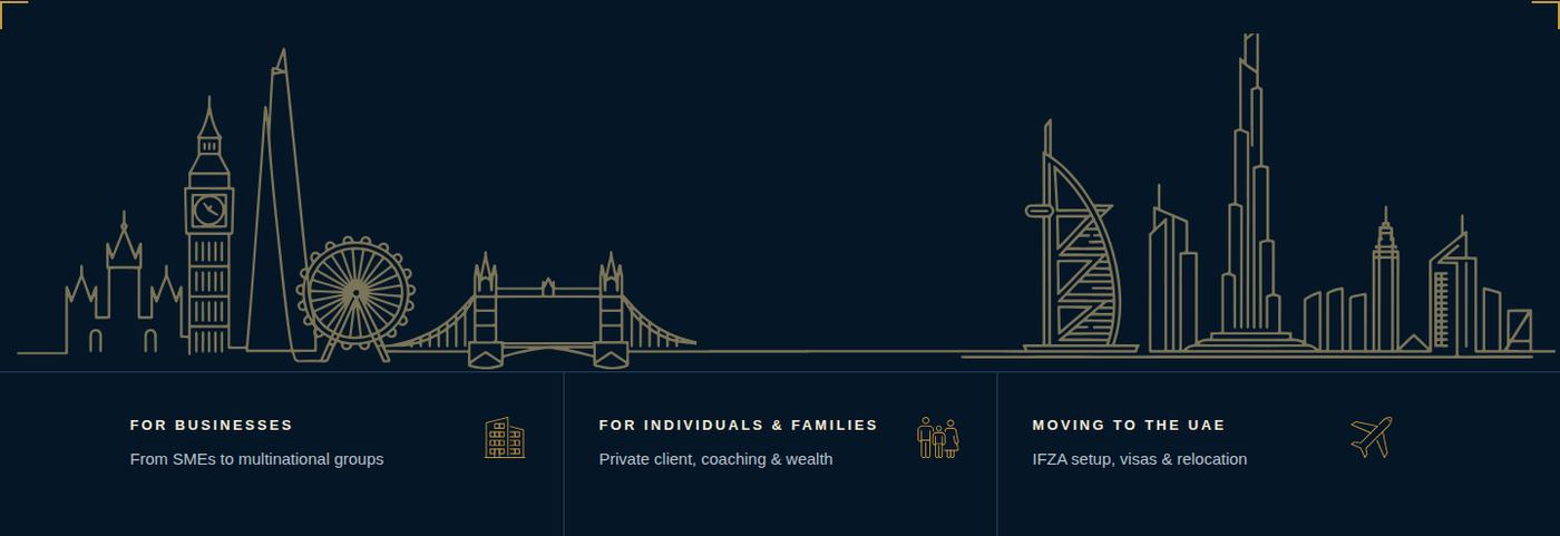
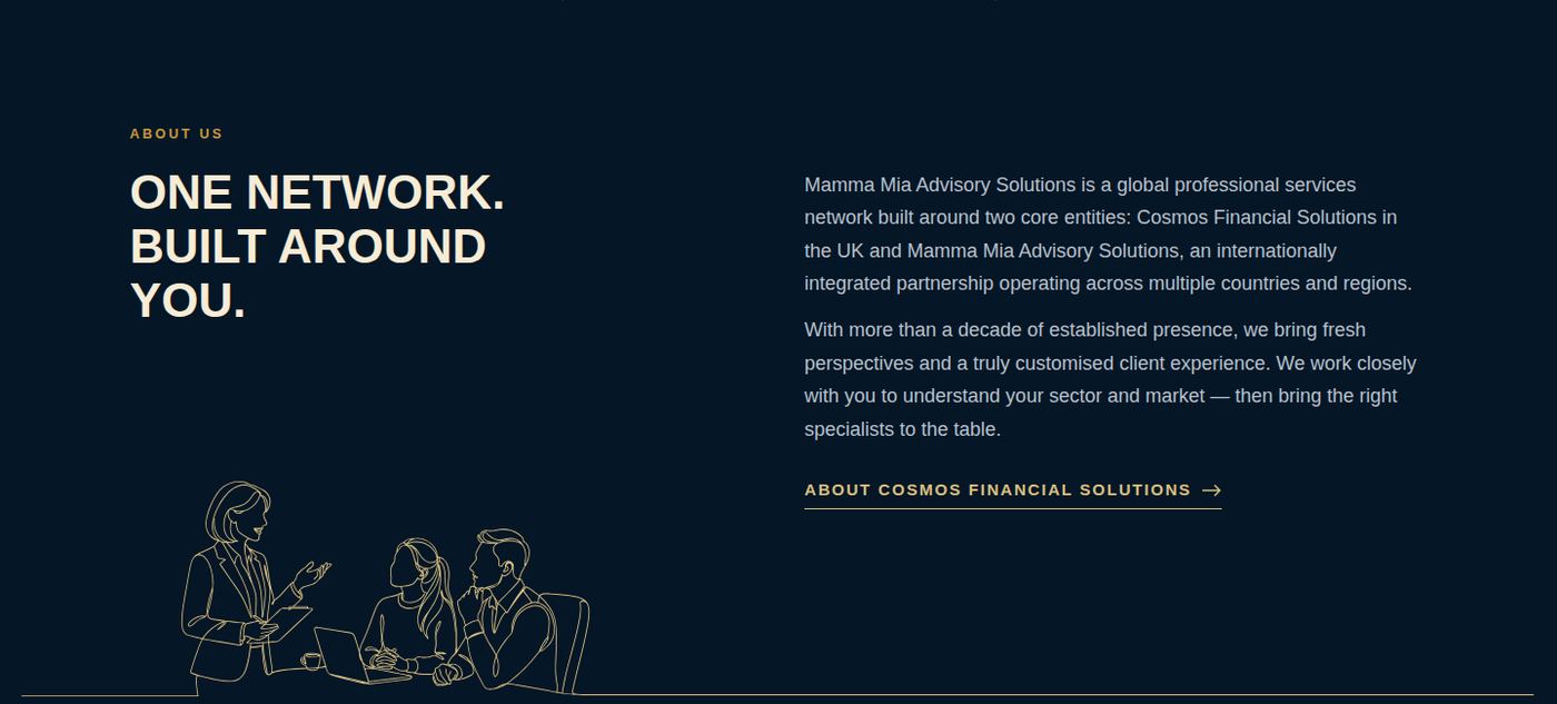
A London-to-Dubai skyline, a team in conversation and a line icon for every service. All of them trace themselves onto the page as the visitor scrolls, then settle into solid gold.
How it was made
Every visual decision was made and signed off before any code was written. The build was handed to an AI coding assistant with a written brief and the original vector artwork, then reviewed and amended in consolidated rounds.
Design directions explored; "True North" chosen with the client.
Compass logo, palette and type finalised in Illustrator.
Home and service page designs approved on 25 September.
A 12-point brief plus the source artwork became a full staging site in one evening.
Two rounds of amends: sharper icons, £ symbols, a slimmer sticky header, logo-star bullets.
The outcome
From signed-off comps to a tested staging build in three working days: a responsive, accessible site with a reusable compass system behind it, ready for the client's real content.